Introduction to Wireframes
Overview
Teaching: 10 min
Exercises: 0 minQuestions
What is a wireframe?
How do you use a wireframe?
Objectives
Provide background on wireframing.
Introduction
What is a wireframe?
A wireframe is a simplified and schematic visual representation of a layout for a dasbhoard/website page or screen that focuses explicitly on the visualling communicating available content and functionalities.
Why use wireframes?
The simpliest way to think about a wireframe is comparing it to the plans used in building a house. Without building plans it is very difficult to build the house. It is also equally challenging to build an interface from nothing.
A wireframe is the first visual representation of a designer’s abstract idea. Wireframing is a fast and cheap way to plan the structure of a dashboard or screen design. Typically, wireframes are used by user experience (UX) designers in the early design process. UX designers use wireframes to communicate their ideas about product design, and they allow them to map out the functionality, discuss the design, and catch problems early. In case the team wants to introduce some changes, a wireframe is much easier to reshape. So, at the end of the day, wireframes save a dashboard team a lot of time.
Wireframing is often the most challenging yet overlooked phase of a dashboard building project.
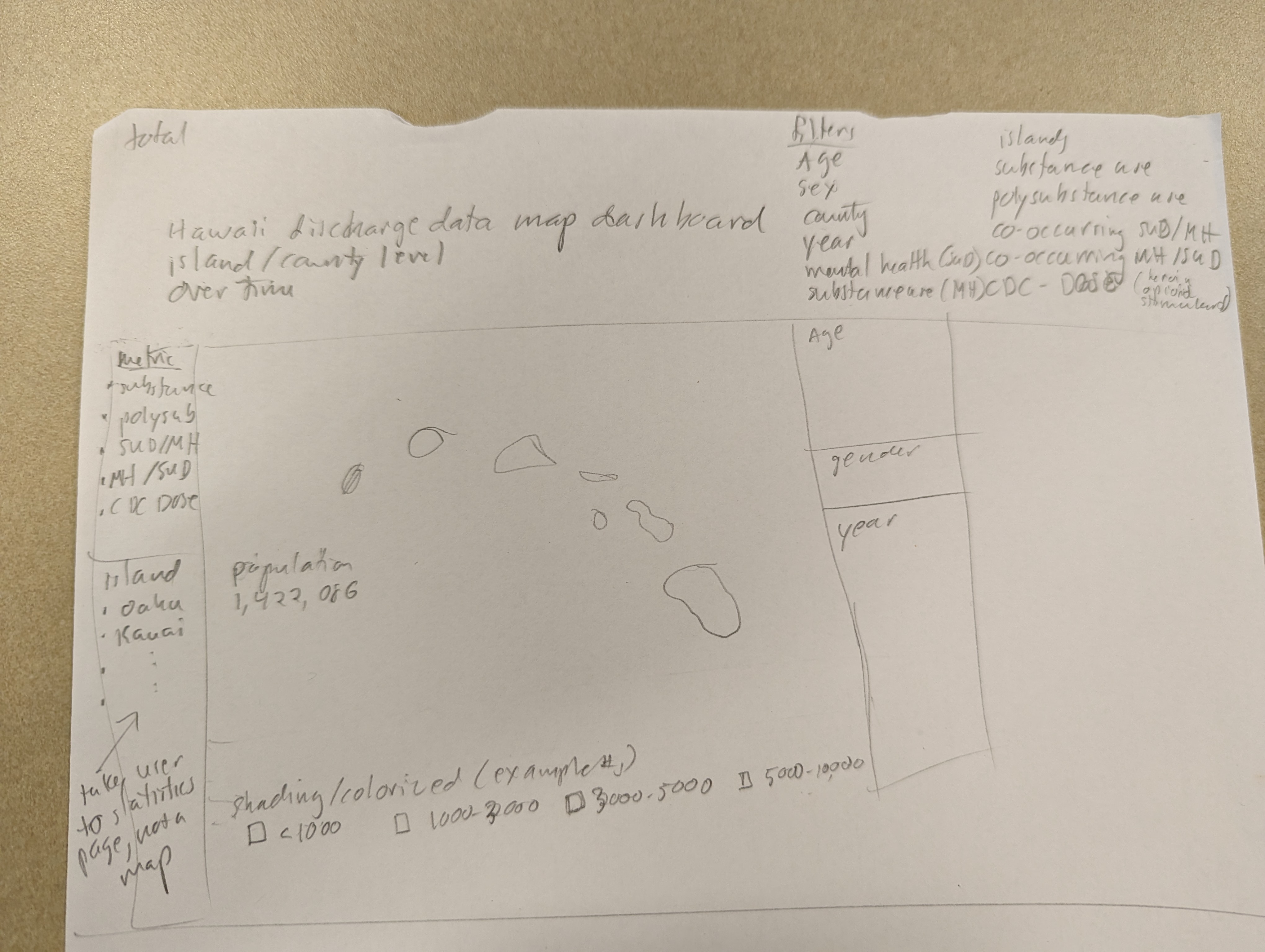
The wireframe captures what graphs and visual displays will be part of the dashboard and how they will be arranged.
These wireframes are not fully functional but a representation of the functionality that the dashboard will eventually contain.
NOTE:
Wireframes a very useful tools for communitcation to developers as well as stakeholders - the old saying “a picture is worth a 1,000 words” is very applicable in this case Also wireframing doesn’t require coding skils -so it can be done before invovling developers
What do wireframes look like
Traditionally, wireframes are low-fidelity sketches or digital illustrations created from boxes and lines illustrating content blocks and navigation elements. The lo-fi wireframes give a product team a chance to see the basic structure of the user interface. By eliminating the color, imagery, and other visual details, designers are forced to think about the big picture—the layout and functionality of individual pages and how they relate to each other.
However, modern design tools allow creating mid and even high-fidelity wireframes without much effort. Medium-fidelity wireframes are created in a monochrome palette, often gray-scale, which makes it similar to the previous one. But unlike lo-fi wireframes, the user interface (UI) components in mid-fidelity wireframes are more detailed and realistic. Mid-fidelity wireframes also can contain real imagery, and this property makes the wireframe look more like mocks rather than wireframes. High-fidelity wireframes are static versions of the app screens or website pages, and they are beneficial during prototyping.
Wireframing vs. prototyping
High-fidelity wireframes are often confused with prototypes because both are created in color and look realistic. Nevertheless, wireframes and prototypes are two different concepts, and they have different aims. Wireframes are focused mostly on the structure of the page. Prototypes, on the other hand, are all about interactions—they created to demonstrate not only how the product will look but also how it will work for users. Prototypes allow testing of the interactions between the user and the interface, similar to the final product.
Benfits of building a wireframe before begining to build a dashboard:
Prioritizes the most important data:
Wireframing helps clearly understand the goals of the dashboard and prioritizes the most important data & information to display.
Help ensures your stakeholders are happy with the final product:
Wireframes help convey the visual feel and structure of the dashboard before spending enormous time and resources on developing the dashboard. Stakeholders have the opportunity to provide feedback and make sure that the dashboard will answer critical questions and offer insights before moving to the development phase.
Aides Communication:
A wireframe helps avoid miscommunication and expensive changes to dashboards after development. Wireframes offer a visual language for designers to convey their ideas and vision for the dashboard for effective communication and visualization. Visual language has the benefit of conveying depth of space, direction, and contrast, which help the viewers make connection and relationship between elements more intuitively. More intricate wireframes can also simulate interactions between elements thereby creating more intuitive representations of the dashboard. Armed with a thorough understanding of the dashboard, all members of the management and development team will be able to raise concerns and collaboratively improve the dashboard.
Note
Having a wireframe that has gone through the iterative process of refinement and approval by all team members makes it relatively straightforward for developers to build the dashboard. The chances of miscommunication and ambiguity in building the desired dashboard are low since the wireframe conveys the dashboard elements and placement clearly.
Key Principle Data Dashboard Wireframing
There are three key principles to ensure that your wireframe is good and useful for all stakeholders.
Clarity:
Your wireframe needs to answer the questions of what the dashboard will provide for users. The wireframe should be an aid for the developers to visualize the dashboard layout and ensure that the user’s most important questions are answered and goals are achievable without being distracted by more aesthetic considerations.
Confidence:
Ease of navigation and access to important insights in the dashboard can increase user confidence in the message being conveyed. Aesthetic elements like buttons or boxes in unexpected places cause confusion and overall dissatisfaction. Details like this can be organized and addressed at the wireframing stage by using familiar navigational processes and intuitive positioning for insights.
Simplicity:
Too much information, text, and colors can be distracting and take away from the main message conveyed by the dashboard. Avoid being bogged down by considerations of colors and other aesthetic elements at the wireframing stage. Attractiveness at this stage is not a consideration.
Key Points
Wireframes are….
Wireframes are useful for…